Plants Combined to Make New Creations
Are you ready for a plant that grows red cherry tomatoes above ground and potatoes underneath or a cross between purple coneflowers and black-eyed Susan? Learn about these and more new plants.
Painters know how critical it is to pick and mix the right colors when making beautiful art. The same is true in the landscape, where the “paints” are the flowers, leaves, bark, and berries. But landscaping with color is even more difficult than in the art studio because flowers come and go with the seasons, light changes throughout the day, and plant colors don’t always turn out to be the same as they looked in the catalog.
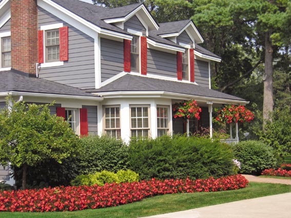
A good place to start — at least with foundation plantings — is to coordinate colors of foliage or flowers with those of the house. Take a look at the colors on your exterior walls, in your door and window trim, even the roof. Is there a color that you can grab and “echo” or repeat in the color of your plants? Here are some examples:
1. A house with light blue siding. Good shrub possibilities might include the silvery blue-needled juniper ‘Blue Star,’ bluish-leafed dwarf fothergillas (try Fothergilla gardenii 'Blue Mist'), or blue hollies, which have dark green leaves with deep blue undertones. Good flower choices might include annuals and perennials with blue flowers such as mealy cup sage or blue salvia (Salvia farinacea), campanula ‘Blue Clips’, and catmint ‘Walker’s Low’ (Nepeta 'Walker’s Low').
2. A house with a burgundy door or burgundy shutters would be a prime candidate for burgundy-leafed shrubs such as ‘Diabolo' (Physocarpus 'Diablo'), or a purple smokebush (Cotinus coggygria 'Royal Purple' or 'Purple Cloak'). One of the many perennial dark-leafed coralbells (Heuchera 'Ruby Ruffles', 'Amethyst Mist', and 'Black Currant' are good selections) would be good at ground level.

© George Weigel
While a matching color is a good place to start, go ahead and build the rest of the garden with two or three other colors that work well with your anchor color. The easiest way to pair colors is to think of them as falling into two main color families: Hot (or warm) and cool.
1. Hot colors are the brighter, more saturated, and more attention-grabbing colors – red, gold, bright yellow, rich purple, orange, and “hybrid” colors that have warm-color parents, such as salmon, apricot, and chartreuse.
2. Cool colors tend to be pastels, softer and relaxing colors – pink, blue, lavender, creamy yellow, soft rose, and the like.
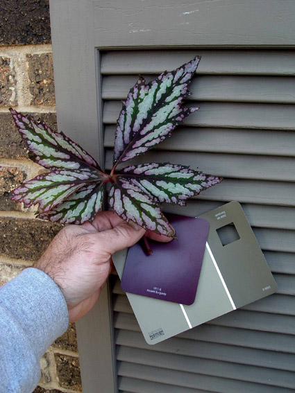
If you start with an anchor color and then pair it with colors in the same family, you won’t go too far wrong. To help with matching, use paint chips from the home center or paint store. First select the house colors and pick coordinating chips that please you, as you would when deciding on inside paint colors. Then take the selected chips with you when you go plant hunting at the garden center.
What makes landscape design a notch more complicated than other art forms is that you can’t pick solely on color. Since plants are living objects with differing cultural needs, it’s also critical to pick plants that suit the planting site. Dead plants all end up brown. Look beyond just flower colors. Keep in mind that foliage colors (and textures) last longer — all year long in the case of evergreens. Green is a neutral color that works with any scheme, so consider a healthy dose of greens to add contrast and to keep from overdoing it with a single anchor color. White, silver, black, and purple are other good “bridge” or neutral colors that usually work in either color family. As an example golden-needled dwarf false cypress (eg. Chamaecyparis pisifera 'Golden Mop') would look good in front of a yellow-sided house, but lining the entire front with them could be overkill. Use a few as anchors, but work in other coordinating colors and greens.

© George Weigel
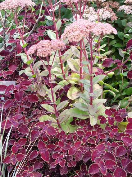
Another subtle but effective way to pair colors is to find a color in one plant that can be repeated in a neighboring plant. A good example would be starting with a pink, cream, and green variegated-leaved caladium (try Caladium 'Rosebud' or 'Pink Beauty'). Pairing it with pink impatiens that match the pink in the caladium leaves perfectly. Or partner a gold-and-burnt-orange bicolored lantana with gold-petaled black-eyed Susan (Rudbeckia hirta). Or plant a patch of dwarf burgundy coleus (such as 'Redhead', 'Burgundy Sun', or Ebony Dwarf') under taller sedums (try Sedum 'Matrona') that have the same color in their stems. The combinations are endless only limited by your own taste.
These days, most plants are already in bloom at the garden center, which makes it easier than ever to walk around holding candidates next to one another, much like holding up a sweater to a pair of pants at the clothing store. If you think you don’t have a good “eye” for color matches, get a color wheel. These are inexpensive plastic color aids available at art supply stores to show which colors pair nicely with one another. When you’re ready to make color decisions, the wheel will show you which colors are exactly opposite to one another, such as blue and yellow, or purple and orange. When done in moderation, exact opposites pair together as nicely as different colors of the same family. Colors next to each other on the wheel are complementary, such as blue and green, or yellow and orange. These also go together well.

© George Weigel
Make notes on what works for you and what doesn’t. Remember, you can always move a “clasher” somewhere else. That’s why shovels were invented.